MAKING MY LOGO

This was my initial idea for the logo. I had had the idea in my head for a while so I drew it out to get an idea of sizing. I'm not very good at drawing so I just did a stickman. I knew that the final logo would actually be a drawing version of me.
As I had never used Illustrator before I asked Darren to help me get set up. I showed him my idea and explained how I wanted it to look. We started by looking for a font to use on:
I always knew I wanted to use the colour pink as It's is one of my favourite colours. Pink also represents friendship, affection, harmony, inner peace, and approachability. These are all things I want my podcast to represent.
Darren then showed me a video of how to make the writing become the shape:
https://www.youtube.com/watch?v=GCHsva6ISa4
We then merged the circle and writing together to make this.
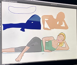
Next we had to make the cartoon of me. After seeing what the text looked like I decided to change the position of my cartoon to in between the writing rather than on top. I thought this would look better and keep the logo to a circle shape. We found the cartoon on the bottom on google images. I then started to trace the different parts of the body. I could the change these to the colours I wanted.

After tracing and moving over the different bits of the body, I changed the colours to what I wanted. I didn't want my cartoon to have bare feet so I googled shoes and added them to my cartoon as well. I decided to leave the face blank as I felt adding facial features would ruin the cartoon.

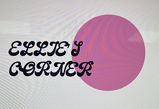
I moved the cartoon to where I wanted it in between the text. I felt that with the way the font is and with my cartoon leg covering some of the R it looked a bit like 'Ellies Conner'. I felt this could be misleading so I decided to change the font.

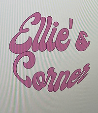
I looked again on 'Dafont' and found the font 'Grease'. I changed the text to this font and found it was defiantly a lot easier to read. The font still had the character I wanted it to have. I placed the cartoon into the position I wanted it in and that was the completed logo.